Murchie's
Brand Identity Renewal for a Tea Brand
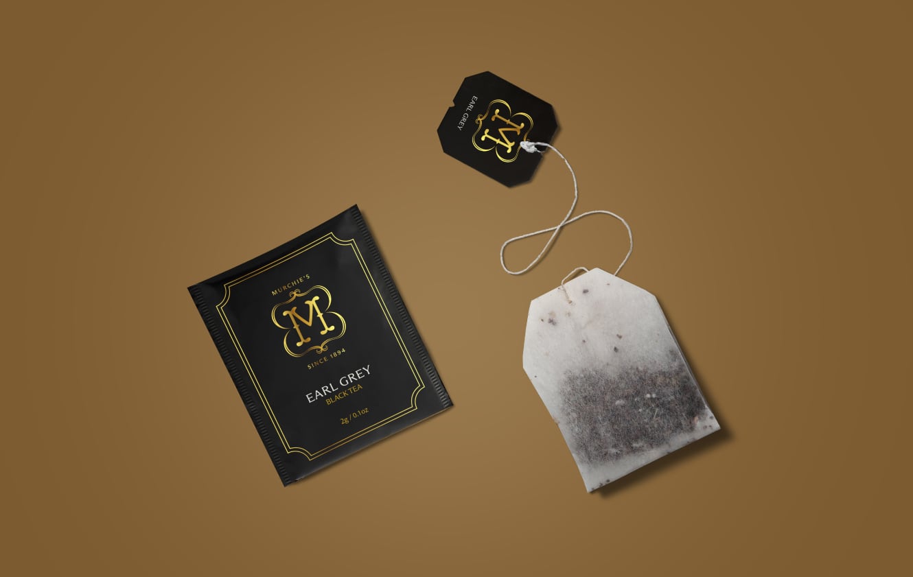
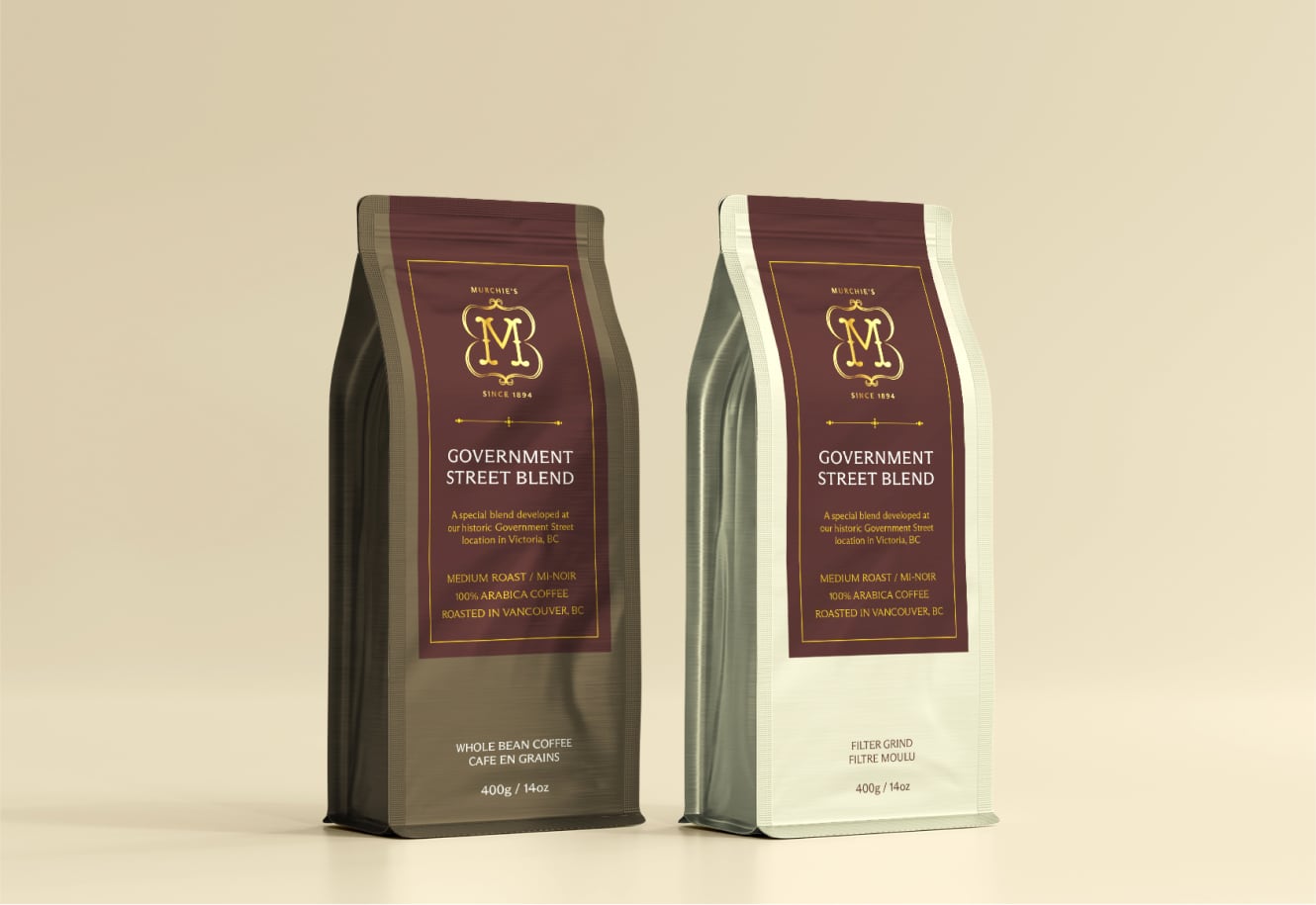
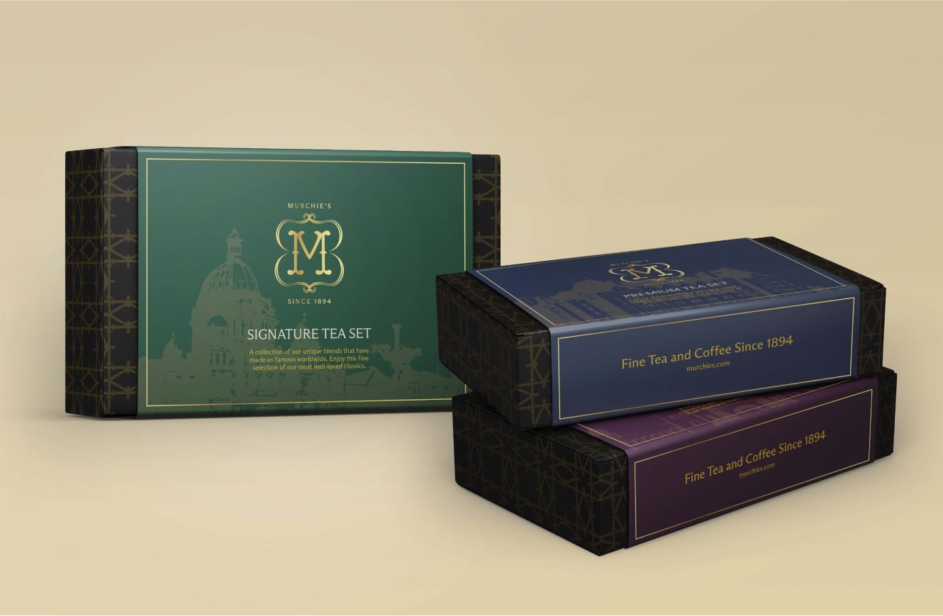
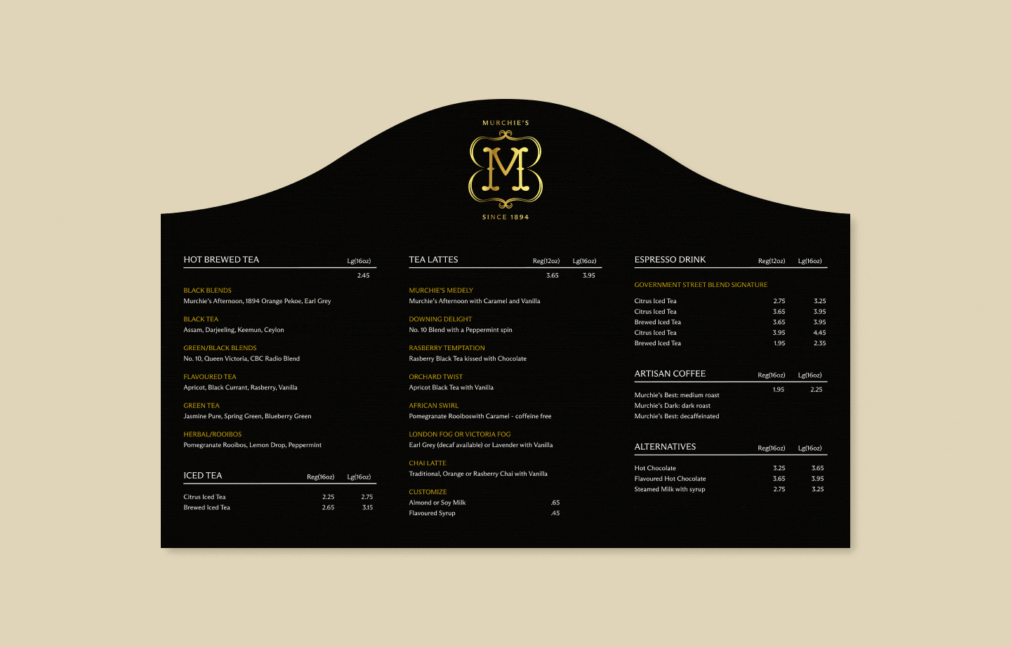
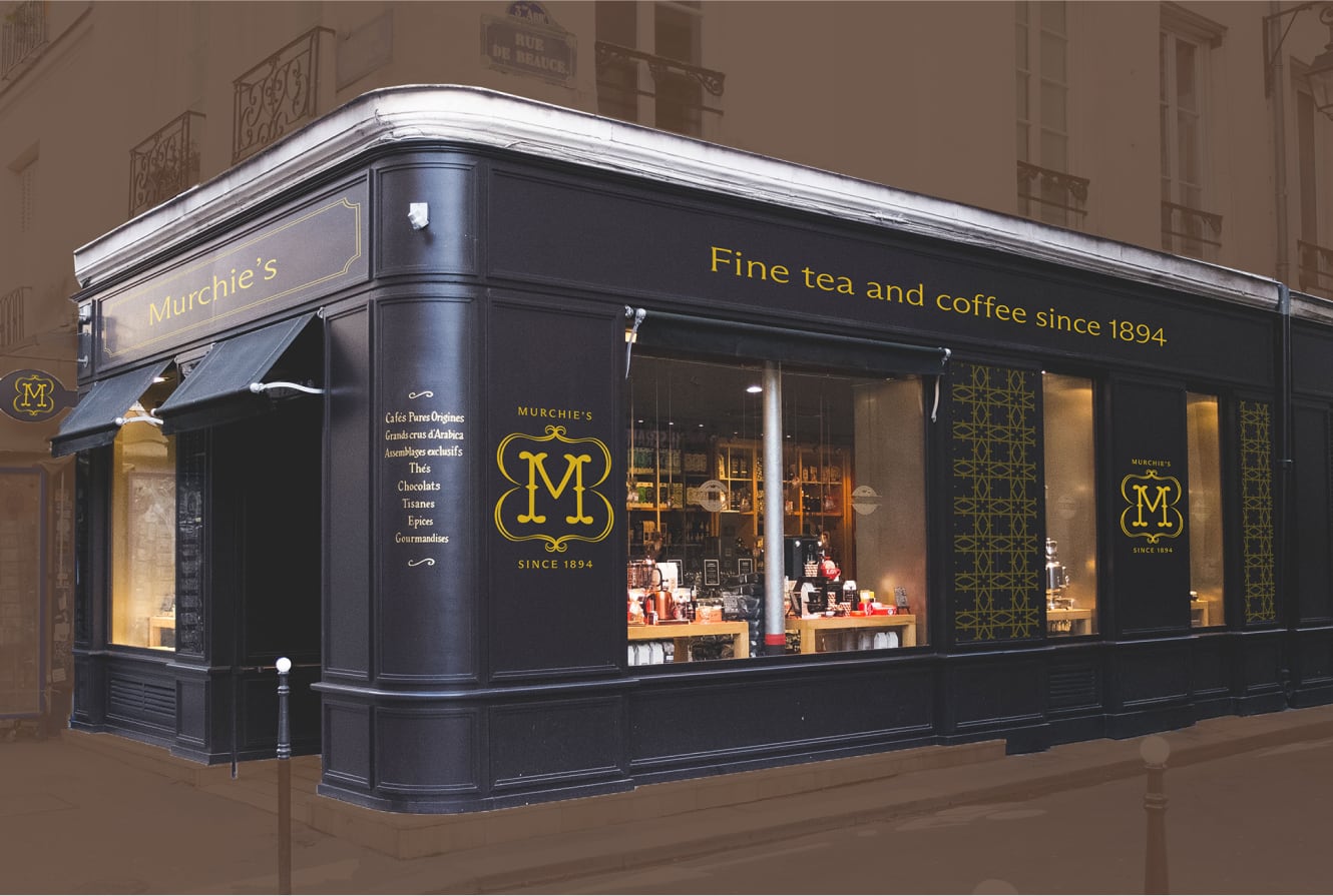
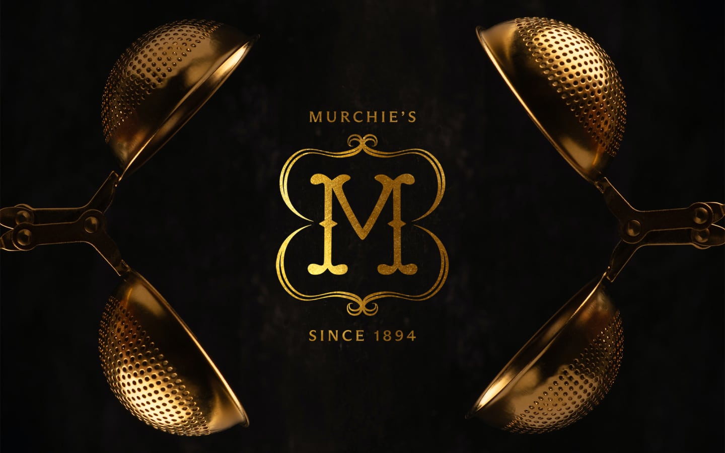
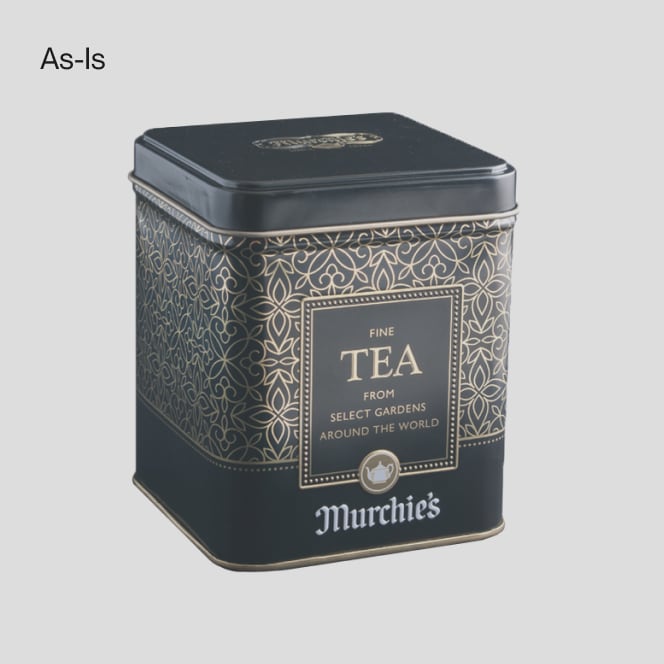
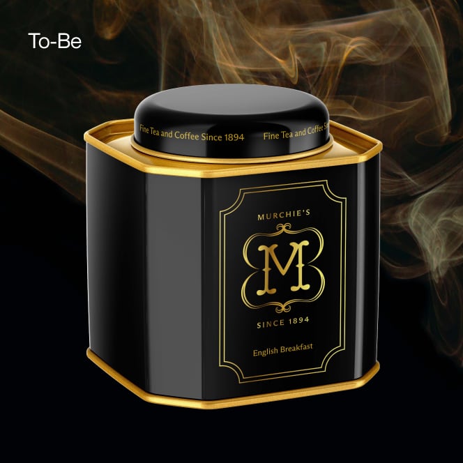
Murchie's, a Canadian teahouse rooted in British Columbia's heritage, has a proud history of providing exquisite products for various occasions, including local, national, and royal events. However, the existing visual identity lacked the uniqueness and elegance befitting Murchie's as a heritage brand. The outdated logo and pattern did not reflect contemporary ideas of luxury. Murchie's new branding creates a more consistent and visually captivating identity that explicitly represents its brand values.
- Type: Brand identity renewal, Brand strategy, Packaging, Marketing
- Role: Research, Strategy, Art direction
- Team: Self-directed passion project. This work is not affiliated with Murchie’s
“Murchie's is a high-end specialty teahouse, proud of its long history since 1894 and its roots in British Columbia, Canada.”
Murchie's Primary Gold
- Hex
- #D1AB1C
- RGB
- 209 / 171 / 28
- CMYK
- 20 / 30 / 100 / 0
Primary Background
- Hex
- #000000
- RGB
- 0 / 0 / 0
- CMYK
- 0 / 0 / 0 / 100
Murchie's Coffee
- Hex
- #452927
- RGB
- 209 / 171 / 28
- CMYK
- 20 / 30 / 100 / 0
“Our brand values are
Quality, Heritage, and Sophistication.”