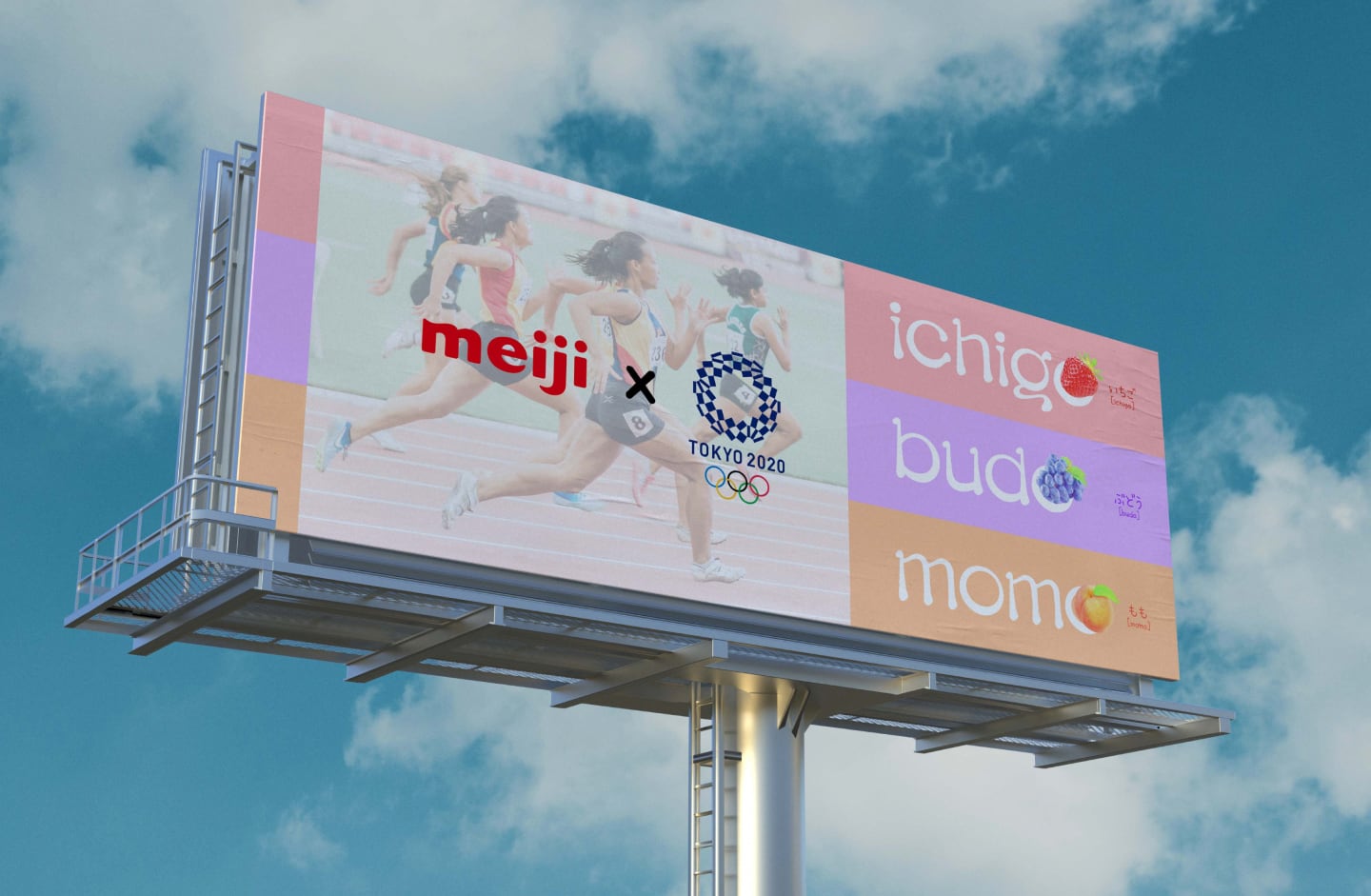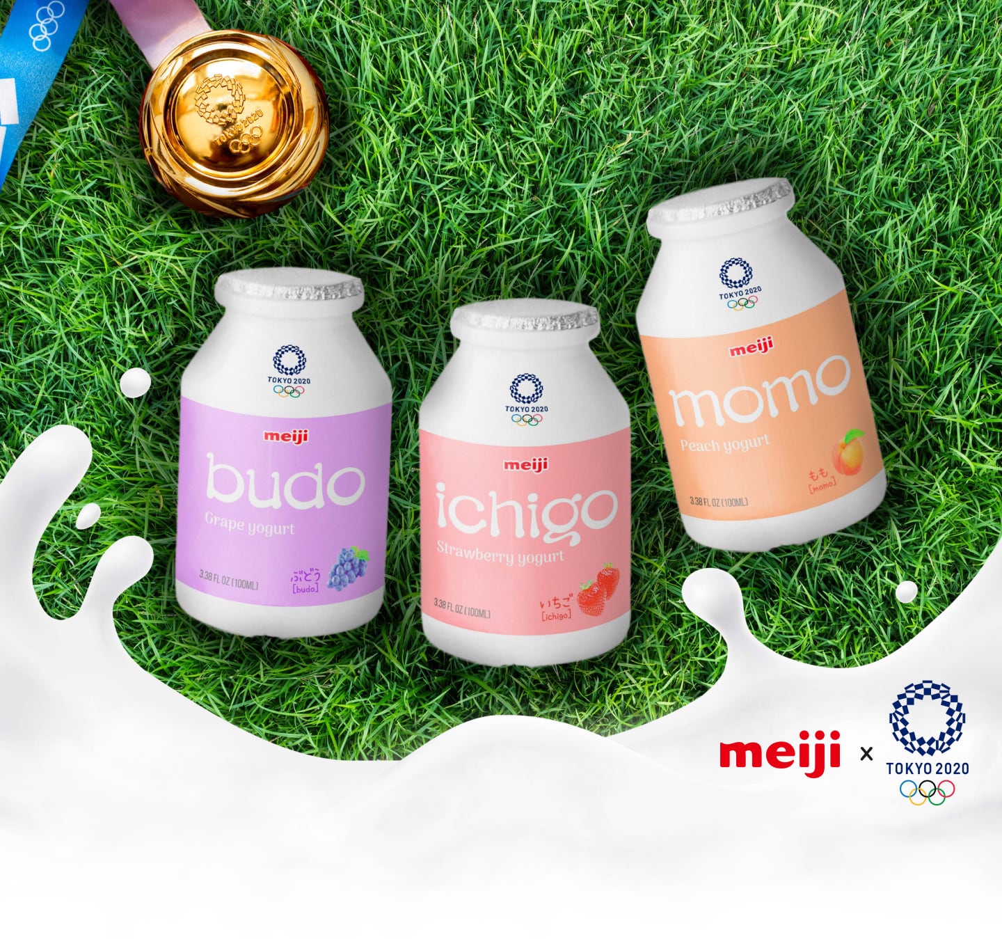
Meiji X Tokyo 2020 Olympics
Campaign for a Japanese Snack Company
Meiji is a large Japanese snack company which exports internationally. This campaign is a great opportunity for Meiji to promote its brand and products through a global event, Tokyo 2020 Olympics. Its goal is promoting Meiji's cold milky products for summer. The strategy was to utilize the host country's language, Japanese, and create a unique font that can highlight Meiji's products.
- Type: Campaign, Marketing strategy, Packaging, Font design
- Role: Research, Strategy, Art direction
- Team: Self-directed passion project. This work is not affiliated with Meiji nor Tokyo 2020 Olympics.e
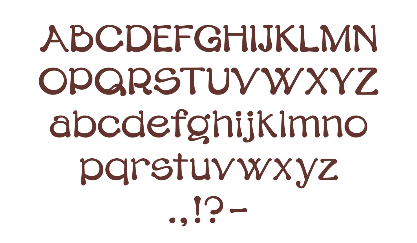
Typeface: Yogurt
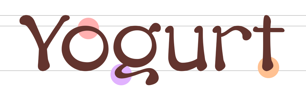
The overall round shapes and high x-height make the typeface look welcoming and friendly which promotes Meiji's brand value: Meiji's snacks are for everyone.
Its unique curvy lines create a harmonious fluid flow that catch audiences' attention.
Heavy weights at the bottom and teardrop shapes are akin to dripping liquid which advertise Meiji's soft, milky products.

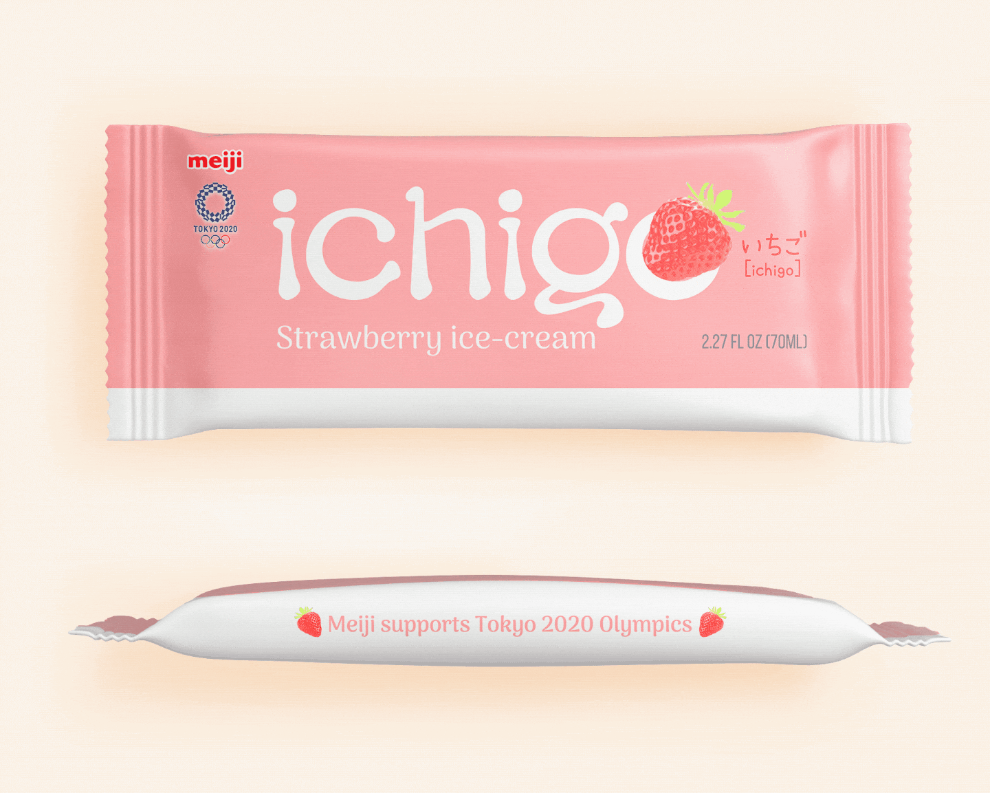
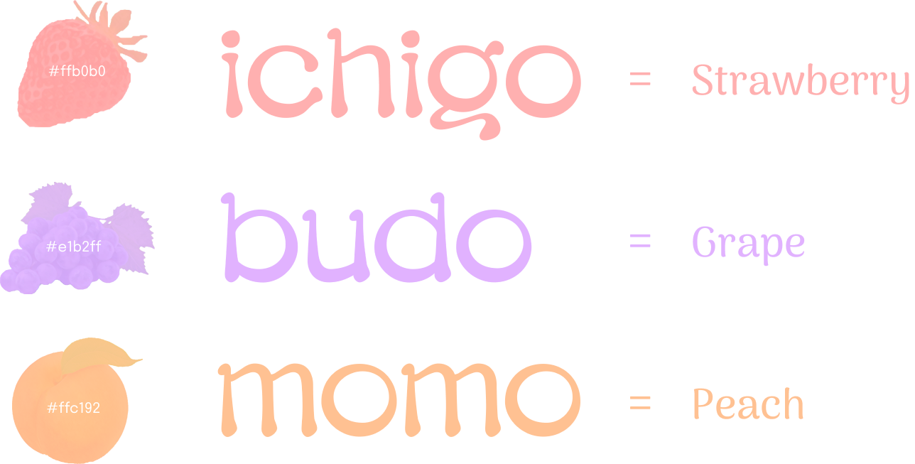
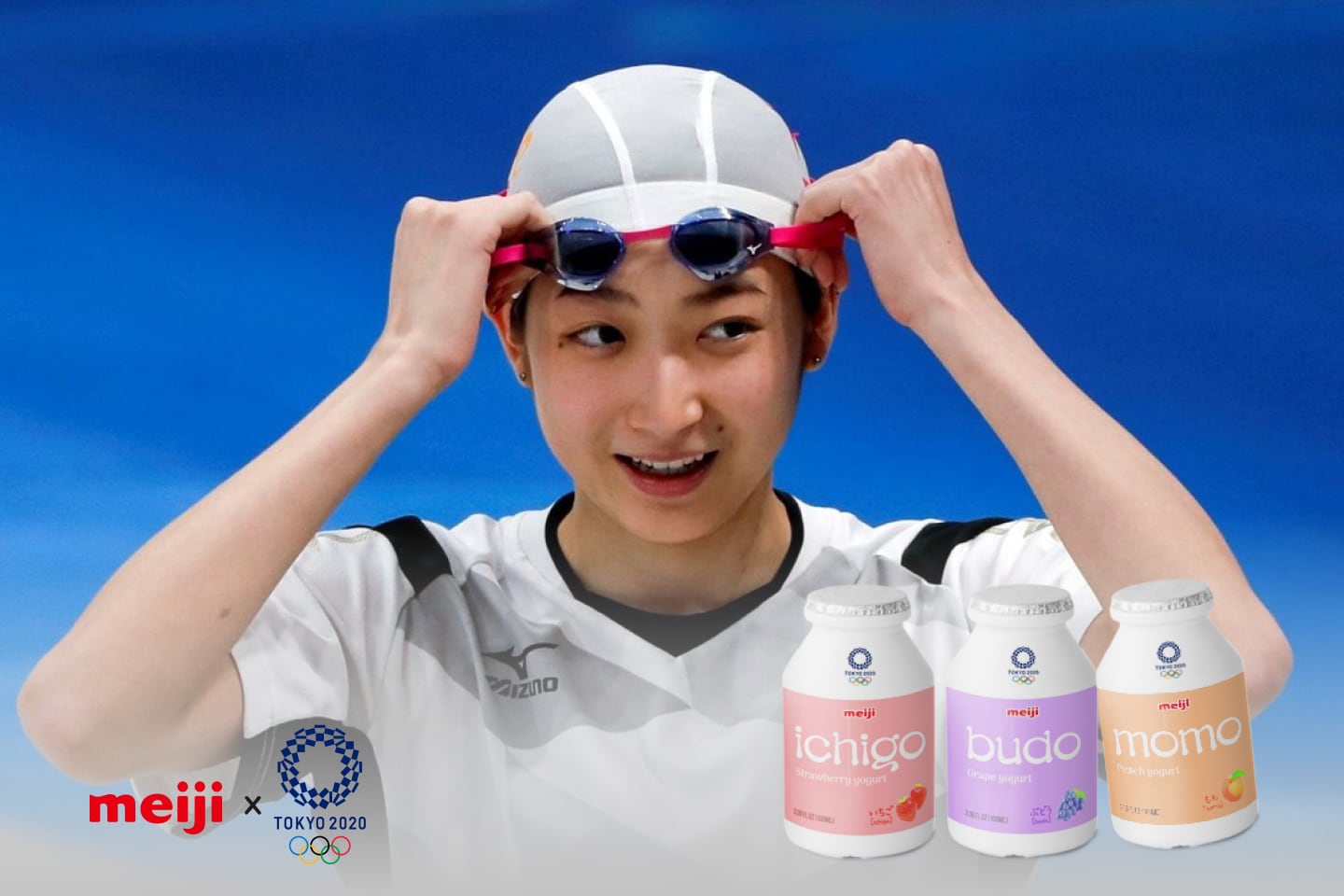
Example